Brand Guidelines
Color
The color palette is a core element of our brand. It is used in the logo, backgrounds, text, illustrations and more.
Primary Colors
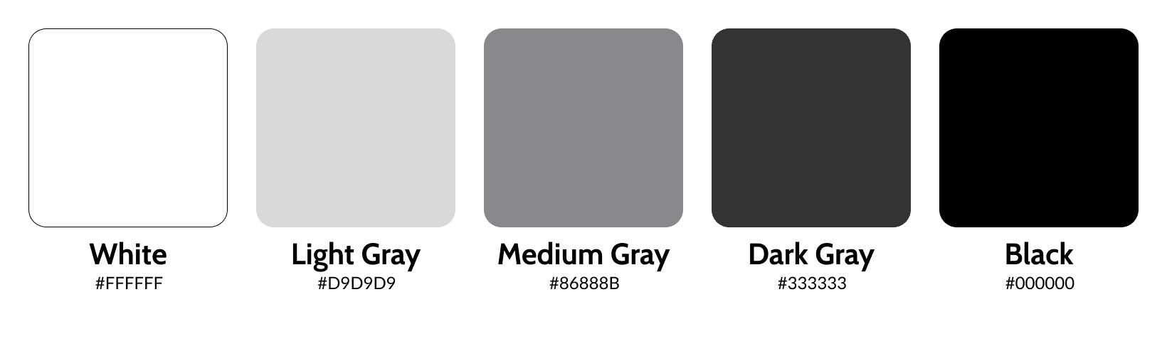
The primary colors should always be dominant in any communication. Black and white should be used in all instances relative to the Kepler logo. On occasion, for special uses (such as the business cards), the logo can be one of the grays from the palette dependent on background.
Secondary Colors
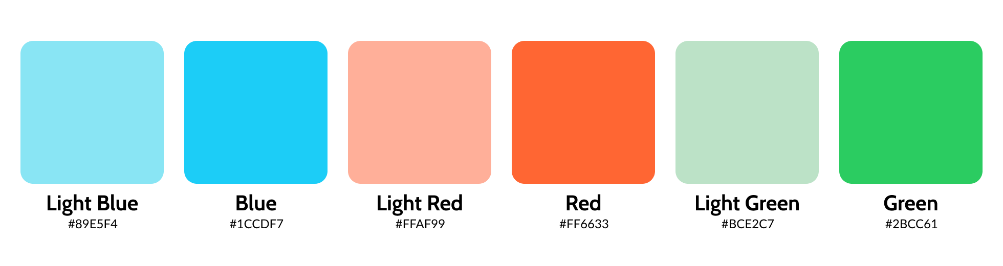
These additional colors may only be used sparingly to differentiate in data visualization applications such as charts and graphs.